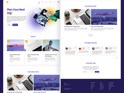
FlightToday Landing Page Design
✈ FightToday landing page design concept - FT a.k.a FlightToday helps users to compare different flight tickets and get affordable flight tickets for their next upcoming adventure trip.
📚 Typography - Poppins(Heading and subheading), Archivo(paragraph and contents). Both the typefaces are popular and easy to read. In terms of legibility, both typefaces stand out.
🌈 Colors - Blue(symbolizes trust, calm, and communicative) and yellow(symbolizes energy, joy, and happiness)
👉You need a second to show some love by tapping the ❤ button and give valuable feedback.
Peace 😉!
🎉 Portfolio:
Behance: https://www.behance.net/suvamp
Dribbble: https://dribbble.com/suvamprasad
📞 Work-related queries contact me through:
Email: suvamprasad5@gmail.com
Instagram: https://www.instagram.com/suvamuxui
Twitter: https://twitter.com/suvamprasad2
LinkedIn: https://www.linkedin.com/in/suvamprasad
