n'22 luxury homes - logo design
Based on research carried out on firms within the same niche (interior & exterior space designers). It was discovered that the top firms in the international and local space had very simple identities, with very little functionality. These identities were either letter mark logos or wordmark logos.
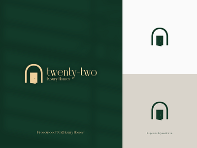
So in crafting an identity for N-22 luxury homes, it was important to focus on somehow standing out. I decided to find meaning before proceeding to craft an identity that stood out from the reference firms researched.
In doing this as well, I was keen on avoiding generic logos that scream homes such as roofs or houses. Therefore, I focused on the name and the services rendered.
N stands for November, so to exude a level of friendliness and approachability, despite being a luxury brand, I decided to dwell on ths small letter “n” to depict a home with a door opened to signify that N 22 offers both indoor and outdoor services.
Lower cases were used for the sake of brand friendliness and to attract a wide audience.
