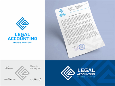
Legal and accounting services logo.
From the brief: "Simplicity. Without pretentiousness and excesses ... formality. Seriousness. Rigor. We are magic that can work wonders with business, help solve problems and find a way out of a difficult situation in the work of enterprises."
Description for the logo: Since the company positions itself as being able to find a way out of a difficult situation in terms of the services offered, the logo contains the idea of a labyrinth, where there are dead ends and a way out. The labyrinth is made in the form of the first letters of the words of the name L and A. By capturing the original idea of the sign, a person remembers it well.
More by Vladimir Pechonkin View profile
Like
