Banking Icons (ING Concept Icons)
Hi!
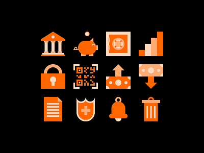
Had some free time these last few days so I decided that designing a concept icon set for ING's website & app would be nice - Here's the result!
ING is multinational banking and financial services corporation - I've been one of their clients and an user of their e-banking app which is called Home'Bank for quite a while now.
The most challenging part was making sure that the icons would be readable as utility icons (I've designed them in a 32x32px square) but still look good & have personality when displayed at much bigger sizes.
Also, designing the icons so that they are easily readable on both dark & light backgrounds, since the dark mode is a thing pretty much everywhere now, turned out to be trickier than expected, but I think I've managed to do that.
Ultimately, the use of 3 colors creates a sense of transparency which I wanted to incorporate since I'm sure that ING, as well as any other bank in the world, values being transparent with the customers.
