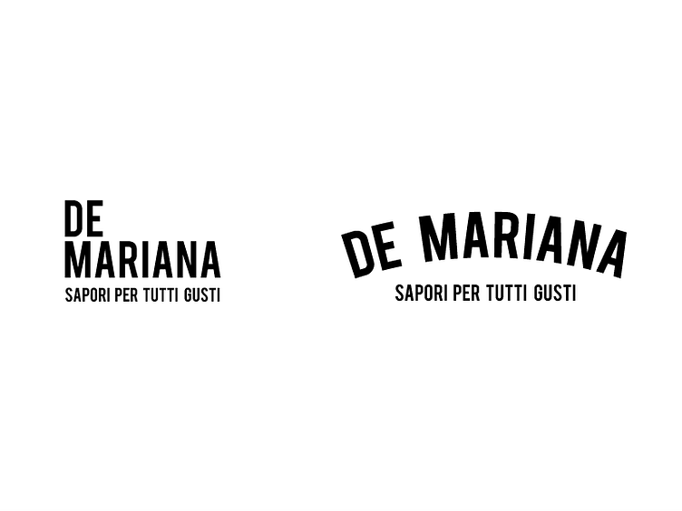
Mariana minimarket logo
big ideas for a small groceries shop in the italian area. I came up with these too visual individuals. De Mariana - Food/Products for all tastes Help me pick one!
Both have potential, as the designs stand their ground and do not show favorable treatment to any product. They provide enough information to present the owner and what she has to offer:
"hi, my name is mariana and you can find the products you need to create a tasty dish right here!"
the designs themselves are nothing new. the one in the right is a trendy one (the arch with the small text under it), and the one in the left is more off a new kid on the block (horizontal alignment but with the name stacked ). the logo will be helped by auxiliary designs to create an appealing experience to the shoppers.
