Synerginen - Logo Design
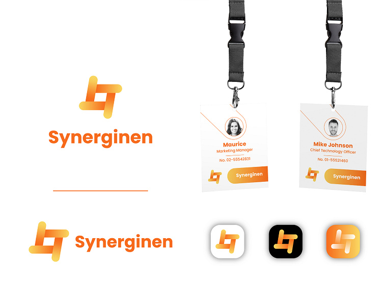
Synerginen is a software-as-a-service product that combines services of several small service providers to make them more appealing to customers through synergy - from which comes the brand name "Synerginen"
I name this logo concept is “Square of Synergy” A simple, modern and flat logo depicting a tightly clinging hand symbolizes synergy in a square.
Orange was chosen as the main color related to the meaning of synergy, happiness, fun, enthusiasm, creativity, and success.
Let me know your thoughts in the comment. I would appreciate it :)
I'm avaiable for freelance project Let's start work together! 📬 faikarproject@gmail.com Let's connect! ✌️ Instagram