UI-components for patients’ medical data service
The team is available for new projects! Drop us a line: hello@purrweb.com | WhatsApp | Website
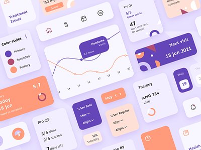
Hello, dribblers! We are here with the new shot — UI components for the medical platform. It’s a service for collecting patients’ medical data in real time ❤️
On the shot there is a card with a graph in the center 📈
And on the right side there is a card of the next visit to the doctor 👩🏼⚕️
There are also tab bar icons and a notification icon on the shot 🔔
On the right are the components of the used color styles, below are the font styles.
The color palette consists of pleasant warm shades that relieve tension, create a feeling of lightness in the body and inspire 💡
😌This platform provides users with their personalized data with tools to record the results that patients report during a conversation.
Press L if you like our design and share feedback!
P.S. We already have experience in designing healthcare app, check out our case 😉
Created by Tanya Shukina


