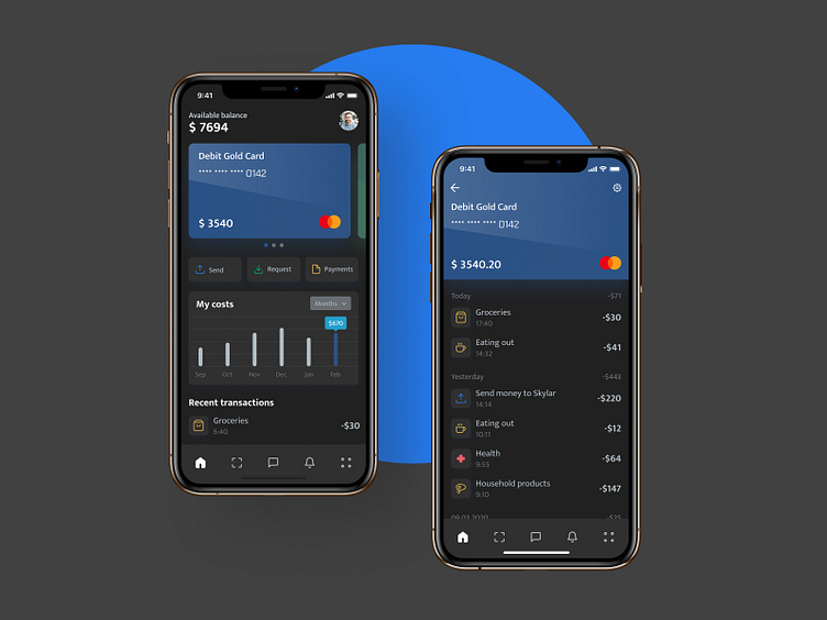
Online Banking design concept
Hi! Today we want to show an online banking concept with regards to the leading cashless trends in a fintech world. What's cool is that it's not an average native mobile app concept, but a cross platform progressive web app one (or PWA). It’s a modern alternative for business, looking to quickly enhance their mobile presence and grow website traffic within a reasonable budget.
The screen on the left shows the homepage when you enter the app. You can see the balance on the cards, the latest transactions and the schedule of expenses here.
The screen on the right shows the view when you check upon your card. Here you can see all expenses in detail and go to the settings of this card by clicking on the icon on the right.
The application has both a dark and light theme, but we showed the dark one, cause everything is on the Dark Side now. In general, we’ve used the Mukta font in this app, but for the card number we used the Chakra Petch font. It emphasizes the numbers of the bank card expressively. Don't forget to visit Codica team website for more cases studies.
We create PWAs , fast and modern cost-effective alternatives to native apps. Contact us to turn your website into a progressive web app.
