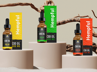
CBD Packaging Bottle Design
Our client wanted to create an easy to identify tincture family that would be cohesive with their current packaging, but could also be a stand alone. We created a color code of Green, yellow, and red based on their branded colors as a system to identify low dose (green), medium dose (yellow), and high dose (red).
The bright new labeling has been easy on the staff and customers when grabbing for refills. Thus, elevating some of the in-store backups they were having due to packaging inefficiencies.
What do you think?
To view more on this project visit Artex Launch
To contact me: Brittany@artexmail.com
More by Brittany Gober View profile
Like
