Brita Logo Rebrand
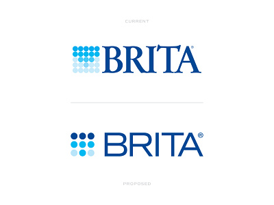
I’ve been wanting to take a stab at updating the Brita logo for awhile now and had a little free time this weekend to give it a try. Overall, I wanted to update the typography to something that was more modern and felt it belonged in this era. Also, while I like the current brand mark they currently use, I felt it needed to be cleaned up and simplified more, yet still showing the water filtration process in the mark and not losing that aspect of its uniqueness. Swipe through to see a couple before and afters of the logo design and logo applications.
What do you think?
___
More by Dylan Menke View profile
Like


