Amazon Product Buying Journey Re-Design
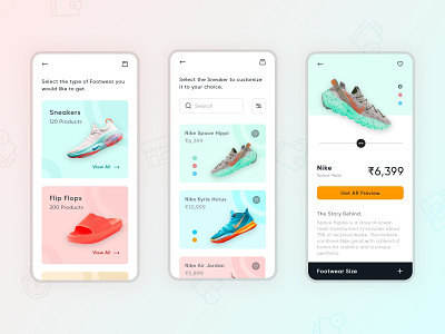
This project is a Re-design attempt for the Mobile Application of one of the popular product e-commerce i.e. Amazon. I have tried to include some of the UX improvements to current design after conducting interviews for User Research with users of different age group. I prepared a set of wireframes while testing them with my interviewees. These are the final result of research I conducted. The improvements that I have added are listed below :
First was making the User focus on a single task at a time and avoiding complex processes.
Second was using the most popular scrollable navigation to increase the finger proximity and simplicity rather than using tabs.
Third was providing instructions at every page to make the user clear about the purpose of a specific page as the user audience can vary from 15 years to 80 years.
Fourth, I used multiple product viewing experiences like 360 degree view and a interactive AR view to let the user interact with the product live and give them a sense of satisfaction for how the product would look when they receive it.
Fifth, I also moved the buttons required for product details ( ex: footwear size in this example ) within a bottom sheet to let the user explore about the product more rather engaging them in product buying journey until they are totally convinced about authenticity and finally decide to purchase the product.
