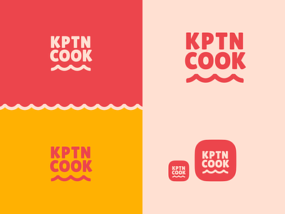
KptnCook Logo Redesign Concept
Hey Dribbblers! 💙
KptnCook is a app that i really use a lot. I really like this app because it gives you awesome easy recipes. Last time i asked myself "mh how does the website from KptnCook look"? 🤔 Yes.. i think it's a little bit outdated, so i wanted to give it a redesign just for fun! :) In my last post i have made a hero header for that. This time i want to go a little bit further and give it a new Branding. These are my first concept of how KptnCook could look like in my vision. Don't get me wrong, i really like their current logo! This should only be a new side from where i look at KptnCook. I think der recipes are really easy and fun to make, so this should be a part of the whole concept.
The next posts will be about KptnCook. This should be a little bigger project to give KptnCook a redesign on the website and the app itself. But this is only my style on how i would see KptnCook. The team from KptnCook did already a great job!
Would be happy to hear some feedback about the color choice from you! 😊
Don’t forget to ❤️ press “L” to support the shot

