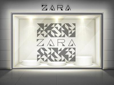
Logo and Pattern for Zara
A completely new look for Zara, starting from the particularly created font of the logotype, both modern and elegant, and the minimal but catchy pattern, based on the triangles in letters. The color palette is the most elegant: black and white.
More by Paolo Falqui / BLØPA View profile
Like
