Style Guide exploration
A few months ago in Eventials, I was invited by the marketing team to function and enhance the look and feel of the new landing page.
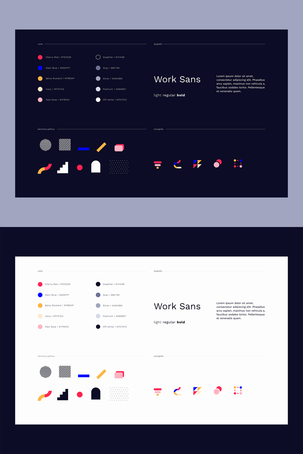
Here's a shot of our visual elements which based the new page style. Color contrast, high readability, geometric shapes and a contemporary grotesque font will let users get what they need quickly and elegantly.
Eventials aims to live among modern interactive brands and I'm working on it, so I will post more about it soon.
Like
