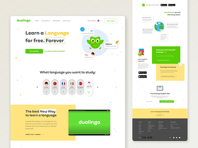
Duolingo re-design
Hello Everyone!
Duolinguo is the platform for studying languages. And here is the main landing page. The idea was not to change the site totally, but refresh style and update structure. The brand color, fonts and characters kept the same but was stylised in the new way. GooglePlay and AppleStore buttons had been used without following guidelines, so this mistakes also was correct. Previously, each button open new landing page, but it is quite uncomfortable, therefore I add menu and after clicking on buttons you will go on the new page not other landing page.
Thank you for watching!
Press [L] if love it! ❤️
Feedbacks are always appropriate 🤩
And follow me if you want to keep in touch 👋
More by Darya Kruhlyak View profile
Like
