Mobile Banking - Spending
PROJECT OVERVIEW
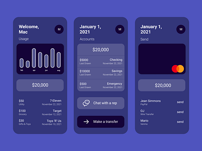
Create an a simplified banking interface optimized to focus on most used components when banking.
For my concept, I wanted to remove all the unnecessary visual elements that are commonplace in this market. The list views are without dividers unless a button is expanded. This was done to relieve visual strain and emphasize negative space.
The color is mutable and functions as a set updating the UI with saturated and original hue. The app presents relevant components by removing one component out of view when another is expanded, for example when the current balance is tapped. I find this to be an efficient methodology when updating the current view.
ROLE IN PROJECT
Research and create an effective and user friendly banking solution for the target demographic.
