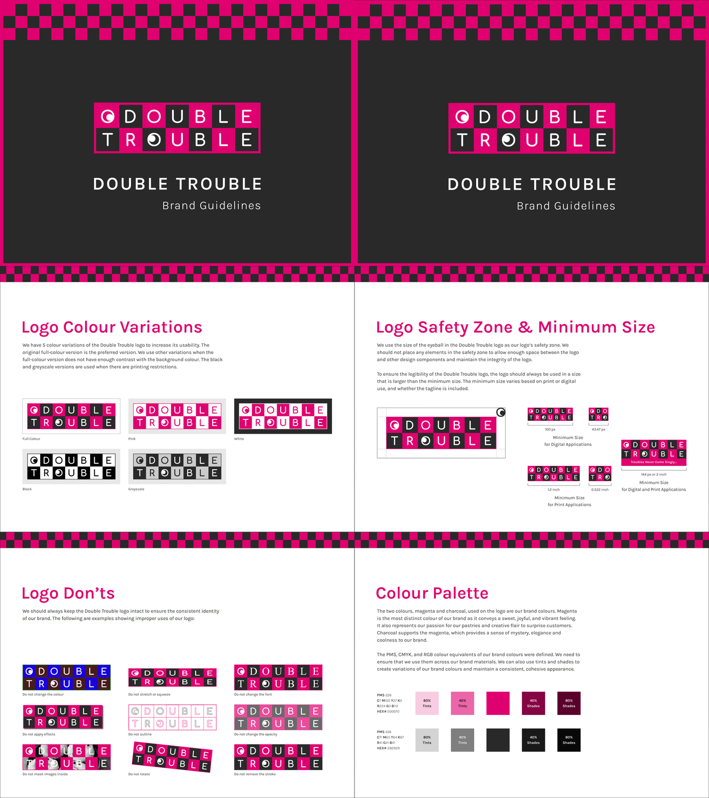
Double Trouble Bakery Brand Guidelines
I was inspired by those brands with strong characteristics and wanted to create an interesting brand just like them.
The checkered pattern in the logo was inspired by a smile with several missing teeth, which refers to the consequence of having too many sweets. To make it more vivid and amusing, I added a pair of eyeballs to the logo. I also utilized the magenta colour to reinforce the vibrant, imaginative, and eccentric brand impression.
The Full Story
https://toyokuo.com/graphic-design/double-trouble/
More by Toyo Kuo View profile
Like
