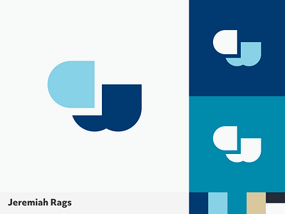
CW Logo Mark
A modernist geometric approach to the overlapping letters "C" and "W."
This was one concept proposed for a wealth management company. Their previous brand identity was dated with muted colors and a more illustrated style logo. They were looking for a fresh update that not only resonated with their current long term clients but also represented their up-to-date relevance to the next generation of wealth builders, which includes the digital tools most young clients expect today.
To help bridge the gap between the existing clients and new ones, I took a modernist approach to creating a monogram for their logo mark. Something clean that would age well overtime and avoid the visual tropes that most wealth management companies tend to take.
–
If you need a thoughtful, simple brand identity, let's work together!
Say hello@jeremiahragsdale.com to get started.
