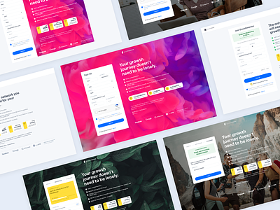
GrowthMentor UI Sign Up Screens
Hi guys,
This is some exploration work on sign up screens we did for testing CR on signup page for GrowthMentor. The approach was 3 steps signup vs single step. Later we added a user screening survey upfront the payment gateway to improve personalised experience, so the user have a better starting point when he enters dashboard.
How do you solve/approach an on-boarding experience?
More by Alek Manov View profile
Like


