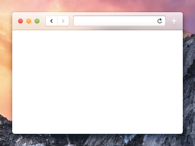
Yosemite Safari (Refined Text Input Field)
@Benjamin De Cock I'm still not sold on the text inputs having dark drop shadows and looking just like the toolbar buttons. I would like to see inputs differentiated from buttons using an inner shadow and highlight on the bottom.
More by Jordan Borth View profile
Like

