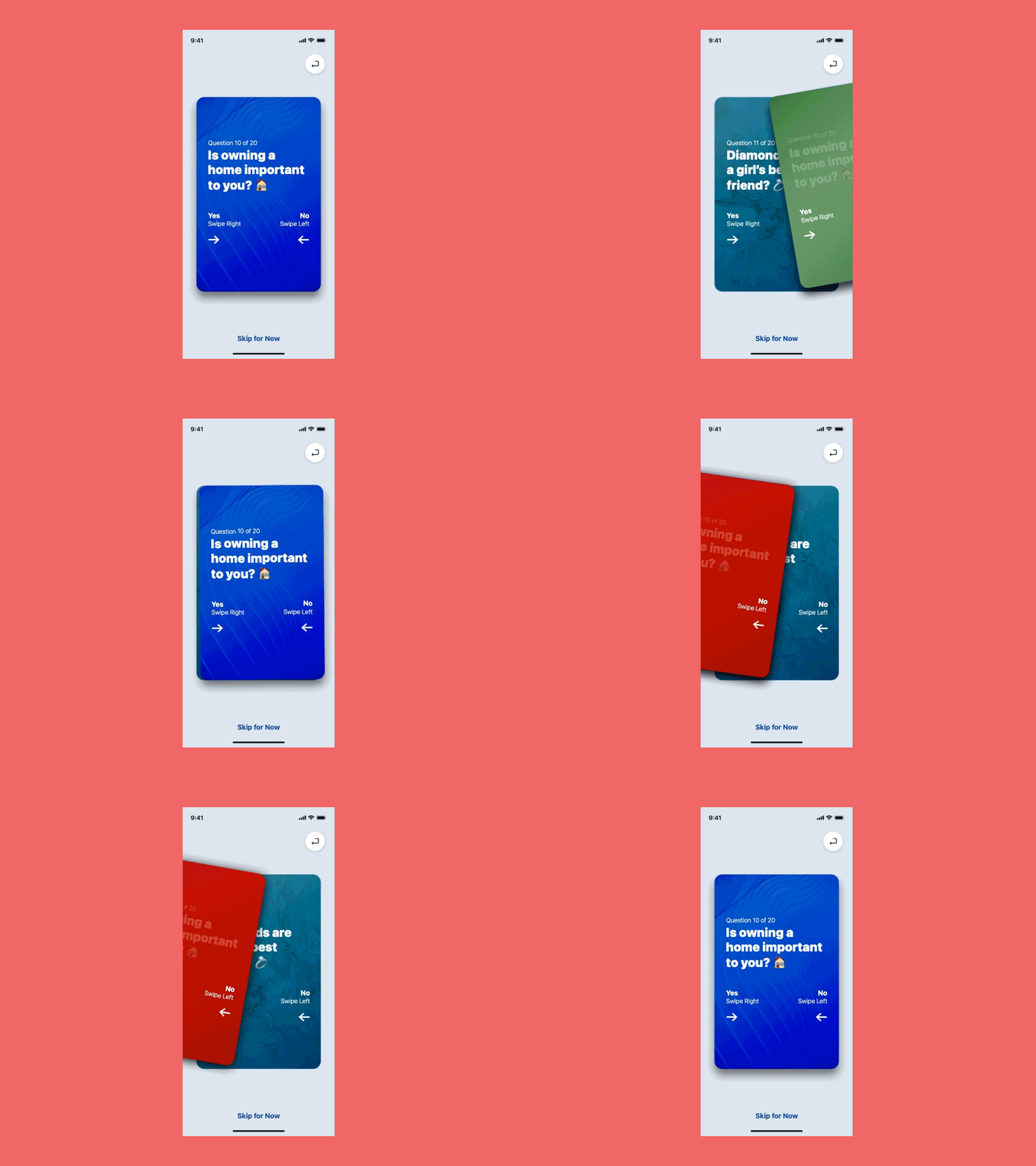
Gesture-Based Quiz Experiment
Experimenting with a gesture-based quiz experience to help native applications become more personalized.
Key Findings:
• Animations go beyond flourish & ornamentation. Different transitions & states of info give critical visual feedback to users — not prioritizing animation can handicap the overall user-experience. 💡
• Timing of keyframes MUST be impeccable. Even the slightest drag of animation or "whiplash" of fast motion can deter users from further engagement. 🚫
My Takeaways:
• Shadows are the worst (especially when overlapped) 🌑
• Using standard-like button & link styles is confusing in a gesture-based experience 😕
• I appreciate Tinder's seemingly simple-yet-complex detail to design ✨
More by John Salmon View profile
Like
