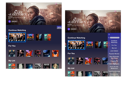
HBO Max Navigation Design - PS4
This design is meant to address usability issues with the Playstation 4 app for HBO Max. Namely:
1. The landing page contains too much content that requires a lot of vertical scrolling, making it difficult to navigate on the PS4. It's also difficult to return to the top of the page easily without scrolling back up.
2. There can be some difficulty in understanding which title is selected.
In this design, I added a navigation bar that slides in from the right side when the Triangle button is pressed on the controller. This navigation bar contains all of the section headers found on the landing page which, when clicked on, will automatically scroll the page to the selected section. There is also a search bar if a user wants to search for a specific title.
To address the title selection issue, I made the selected title expand into a horizontal format to differentiate it easily from the surrounding titles. I also added a large border around the selected title.
Please let me know if you have any feedback!
