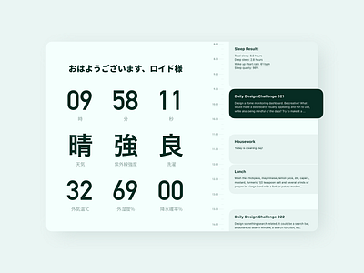
Home Monitoring Dashboard on iPad
Day 21 Challenge: Design a home monitoring dashboard.
Since I had no experience in Home Monitoring Dashboard, I actually started to follow some other reference examples on Dribbble to design.
But the design didn't go well and I felt very awkward with the design.
I got stuck in a rut, but the mail from the daily design challenge reminded me, "Be creative! Make one that you need to refer to daily"
That's it! Those gorgeous dashboards have too much information and blocks that I don't need, and I don't like the mess!
So I deleted most of the blocks and icons, and finally found that the most beautiful way to present the necessary information was in kanji and number (I even replaced the weather icon with kanji!)
Since I used too much kanji in UI, I'll explain the page a little.
At the top is "Good morning, Lloyyd".
The first line of numbers is the current time.
The second line of kanji is the weather conditions.
The third line of numbers is the temperature, humidity and precipitation probability.
The timeline on the right is my daily schedule.
That's all I need! Not so much weirdness! I love it!
The page can show more home monitoring data by switching data slots by animation. But I don't have that time. Maybe redesign it after the whole challenge.

