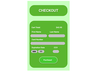
Mobile Credit Card Checkout
Daily UI Design Challenge #2. My primary focus was getting the Purchase button to pop. I achieved this with thin white border, light shadow, and a slightly lighter color than the background.
More by David Seletos View profile
Like
