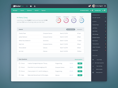
Student Dashboard
Put some finishing touches on an online student web app I was working on back in March. In this comp, I added a bit of shadow to the switches, along with subtle gradient to the navigation area. I think this is a pretty good combination. The client didn't want to go completely flat.
Follow me on Twitter
More by Mossio View profile
Like

