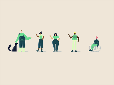
Lition character development
Lition required an illustration style that could be used across static illustrations, iconography, infographics and animated videos.
The style needed to stay true to the Lition brand whilst engaging their customers and audience by appearing fun and positive.
Described as the ‘N26’ of green energy brands, the Lition illustration style needed to strike a balance between appearing fun and engaging whilst also looking trustworthy and believable.
Lition wanted to avoid looking too cartoonish, insincerely joyous or happy to create believability with their target German audience, who it is said won’t fall for the overly happy trope.
Therefore, characters were sketched and developed for use in Lition's product video that used a combination of geometric and more organic shapes to give them some warmth and character, whilst making them animation friendly in After Effects.
By creating a 'style dial' on the 3rd slide, we were able to find the sweet spot between looking too serious or overly joyous as described previously.
Keep an eye on my Dribbble to see more posts about Lition.


