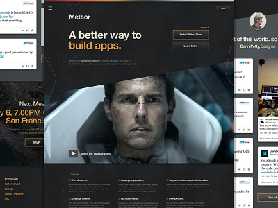
Meteor.com Exploration _V 2.0
Not too long ago I got to do some fun, quick explorations for Meteor.com. Here's a preview at another one of the looks. This one was still spacey, but more of a serious approach with a little attitude. It also kept with the traditional Helvetica fonts they've been using.
This approach was actually the one they preferred. I'll post the other ideas I came up soon!
The image of Tom here was just a place holder for the style of videography I wanted. Very space commanderish.
BTW, I highly recommend giving Meteor a try! Great product, great people, great community!
Follow Meteor at
@meteorjs
More by Dann Petty View profile
Like

