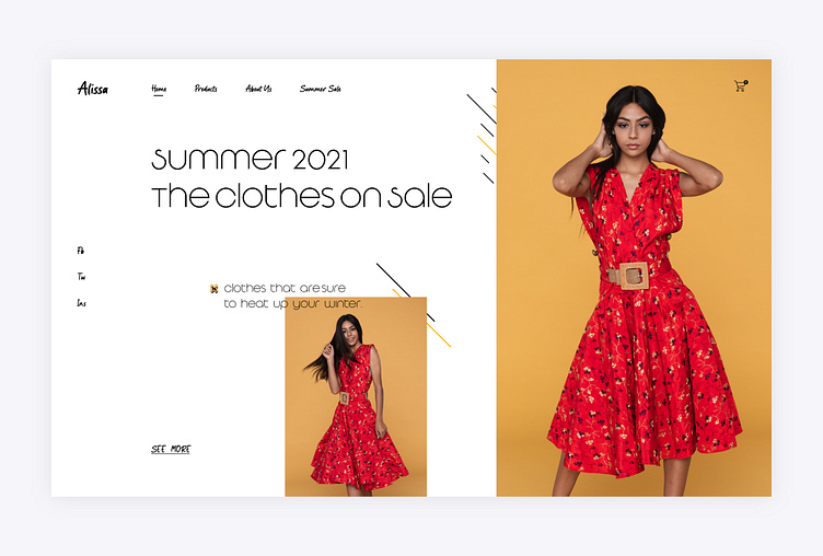
Alissa Brand Landing Page ui
The clean layout brings out the product and styling while a cluttered design can confuse your visitors and increase the bounce rate.
Many famous brands highlight only one product photo above the fold while others present multiple products in a clear layout.
I have used combinations of two fonts to make it more premium for the target audience of the brand "Alissa". I have picked subtle colors to make it more minimal, clean and modern.
Let's discuss and strategize for free.
WhatsApp: +923067734944 Skype: umairrazasyed_1 Instagram: https://www.instagram.com/umair_uiux/ Twitter: https://twitter.com/umairrazasyed LinkedIn: https://www.linkedin.com/in/umair-raza-syed/ Behance: https://www.behance.net/umairrazasyed
Thank You!
More by Syed Umair Raza View profile
Like
