BRE Drib 02
Unused concepts for a branding and identity package for a local real estate company.
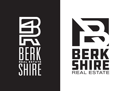
Spent a lot of time working with the relationship of between the B & R to form something not traditionally seen in real estate branding.
The lockup on the left features a monoline design where a house is seen within the B.
The right focuses more on an monogram style and negative space. The house on the left is formed from the shapes of the letters reinforcing the negative space theme. the B is featured prominently while the diagonal line that lends itself to the roof of the home combines with the horizontal line of the B to give us the R.
