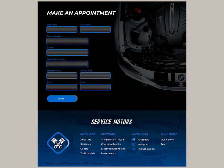
Contact Form and Footer for Car Service
Hello, guys! ✌️
The last two blocks at the main page – Contact form and Footer.
The full description and the first block of project you can read here 👈
Contact form contains all the required information about client and his car, size of fields relevant to the data you can put on it. I put a light gradient to create the volume in the inner space of fields. On the ride side I put almost transparent picture of the hood of BMW to balance the composition of block.
I wanted to create heavy footer – with full logo, the names of main sections and services. It was difficult to balance text blocks and logo at the container, so I tried to give them a sufficient portion of white space. At the background of footer, I placed picture of car to separate footer section from the contact form. Also made dark blue gradient to increase the readability of the text.
🔜 At the next shots will show you the process of making another blocks of this project, stay tuned 📲
Don`t miss my next works ➡️ give feedback ♥️ and hit button Follow!
⬇️Subscribe⬇️ 📷 Instagram 📕 Facebook 💻 Linkedin 📧 lytvyndmytro89@gmail.com
