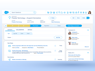
Salesforce Lightning CRM Redesign
CRM design should be intuitive and straightforward. The user won't need all the icons/function display in front of their face. A few command functions and the popular feature should be good enough. A good arrangement of visual hierarchy & applying the gestalt principles should make a decent CRM experience for users. I use Salesforce corporate colour as link text and icons colour to make the overall design more unify and promote the branding.
More by Chin Wee LEE View profile
Like
