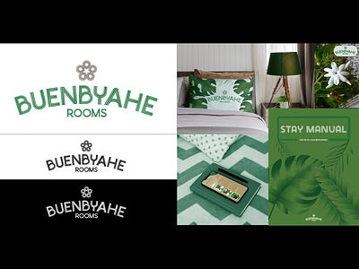
BUENBYAHE LOGO
The Word-mark, Buenbyahe Rooms, is unique lettering that is inspired by the Philippine flag. Using triple lines from the sun rays and a strong mix of geometric curves and straight lines to balance the organic and security that your customers will be seeking. The arc used in the word buenbyhe is also the rising sun.
The Icon-mark is influenced by the Jasminum sambac flower, the national flower of the Philippines. It states the natural and local appeal that the company holds.
There are a couple of hidden symbols in the logo too. The icon has a star in the negative space representing the green celebration of life. In Capital B, a location pin shape is in the lower half, a common symbol for specific locations on a map.
The colour green was chosen to drive home the notion that you are a green, eco-friendly company.
With all of that added up, the customer will see - peace of mind and comfort.
