iPhone Always-on Lock Screen Concept
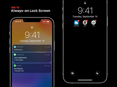
An always-on display is rumored to come to the next generation iPhone. When thinking about the UI of this feature, I believe that the best solution is to approach the solution in a similar fashion to what is already in place. I do think that some design language can be lifted from Apple Watch, however, I'm cautious to take that too far.
In everyday use, I would like to see the lock screen stay largely the same as the lock screen that we are all used to. Much like on Apple Watch, the background will be blurred, the UI darkened, and the screen brightness reduced. This is done to visually signify that the device is on and ready, but not active.
A super simplified lock screen would be great for times when a fully on display would be less than ideal. Implementing a simplified lock screen would work well in low light, Low Power Mode, even a Nightstand Mode. I believe that the simplified notification view should be used sparingly and enabled with intention.
I want to give ControlKit, another shoutout here too! Adding the ability to customize the quick actions would be huge. With an always-on display, quick actions are even more accessible—so it’s important that these actions are useful to each individual.
What Lock Screen and notification improvements do you think Apple should make in iOS and iPadOS 15?
