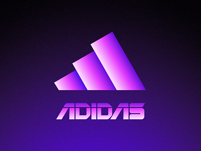
Futuristic Logos #1 — ADIDAS
Hi everyone, would like to share with you an Idea I had for a while now, which is to reimagine how would famous brand logos look with a futuristic approach.
The first one is one of my all time favorite logos — adidas and it's iconic three shaped symbol.
I went with some dimension for the logo by applying high contrast gradients. For the type wanted to combine it with a techy / futuristic feel while also keeping it sporty so have crafted this custom wordmark.
This is a concept and mostly done for practice and exercise, but still would be opened to your thoughts.
Thanks!
More by Mihai Dolganiuc View profile
Services by Mihai Dolganiuc
Like
