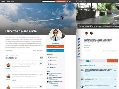
Yabbly Interviews Redesign
The main interview page at Yabbly was cluttered. I decided to give it a small redesign to remove all the borders, shades, and lines. This quick visual redesign came out much cleaner and more modern. Critique and comments are welcome. :)
More by Andre Sebastian Tacuyan View profile
Like


