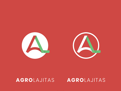
AgroLajitas - Brand Identity
Brand identity for an important agricultural service and product providing company from Argentina. The client wanted to update their identity to a more modern and clean look to showcase in an upcoming worldwide event.
The letters "A" and "L" that make up the logomark were integrated into one shape. This was done in a curvy, clean and modern way to indicate a progressive mindset.
The color pallet used was part of a requirement set by the client due to their general marketing strategy at the moment. The leg of the letter "L" symbolizes nature, as can be seen by its' shape and color.
More by Nicolas Fanjul View profile
Like
