Ticketing App UI for Train Booking App
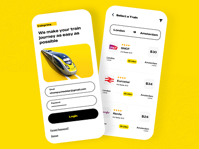
This is Train Ticketing Mobile App. There are four screens for this exploration to present my idea. This is light version for this exploration.
Here are the main concept detail:
After user has logged in to the app. A will see the greeting, and show the train categoty card menu on the top with slider navigation. And we have the active ticket appear on next section. So basically each section in this home screen is very dynamic. Data can be changed periodically according to active tickets, menu or category that user usually use.
The concept on choose a seat screen is when user slide down or up, the train car number will change and show to the user the train car number that they are looking at. This concept aims to put quick preview of the train car number and available seat.
Show Some Love and Follow me on Dribbble :)
Feel free to drop suggestions and feedback.
Do Like and comment.
your feedback and appreciation are always welcome.
Does this look awesome😍 to you?
Thanks for stopping by.
Have an amazing day folks😀


