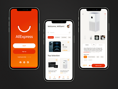
Redesign AliExpress app
Hello everyone! I want to present my redesign AliExpress app!
🔹Main login screen with registration (collecting users' contacts makes it easier to offer them products in the newsletter), also added logins via Facebook, Google and AppleID. Given that not everyone wants to sign up right away to buy, left the option to sign in over registration;
🔹The product catalog welcomes personalization. In the center of the tab bar is placed the shopping cart as the target action of the application. In addition, based on the needs of online store visitors, the store feed, favorites and orders are also placed there. This will allow navigating through the app as quickly as possible. All chats, games, etc. are moved to the profile tab;
🔹The search in the catalog is possible by filters, as well as you can open one of the categories-samples of products. To the right of the category menu are the most popular from the last month;
🔹The product card is divided into 2 main tabs: reviews and review of product details. When shopping on aliexpress, you often wonder what other buyers are saying about a given product or seller;
🔹The product card page has the price, the cart and the add to cart button in the tab bar. They are fixed on the screen so that the user can add the item to cart at any moment of studying the card;
If you like 🧡 my work, it will be my motivation to create more projects.
