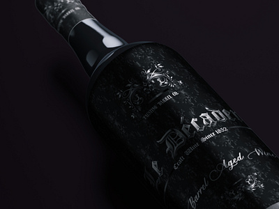
Wine Packaging
Designing the label for this project was a great ride. I designed the background illustration first, rendered it into a light chromatic finish, reduced its opacity so that it does not over power the rest of the design. A chromatic logo/label name for the wine was then placed to create premium contrast with respect to the black background. Usage of cohesive type fonts was used to create the vibe of luxurious, premium and intriguing design. That was my process, head over to my portfolio on Behance to know more about the project.
Thanks !
More by Veera Deep View profile
Like

