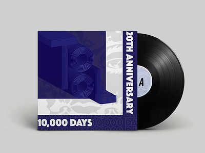
Album Cover redesign
Redesigning a Tool album cover is something I've wanted to do for a while. Tool album covers are inherently known to be reliant on patterns and psychedelic imagery. I think of technological themes, depth and perspective, and confusing the viewer. I didn't want to make a traditional Tool cover. My goal was to focus more on type and have it be driven mostly by the wordmark. I wanted to make it mine, but keep certain elements that could be recognizable and identify it as Tool. I kept the color pallete, and brought back a vectorized image of the face pattern seen on the original album as a background texture/halftone.
More by Harrison Isaac View profile
Like
