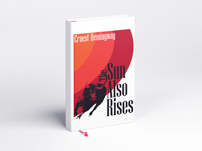
Book Cover reimagination
The main idea of this design was highlighting one of my favorite sections in the story, which is when the narrator and supporting characters are at a bullfight. When working on this cover, the connection I made first was the red cape the bullfighter uses to get the bull's attention and the rising of the sun in the title. In my head the design would be an almost overpowering and distorted sun, abstracted and showing the power the cape has over the bull. Another strategy I found to be very powerful was the juxtaposition of hyper-realistic drawings/tracings with simple vector shapes and type. Getting the three to communicate properly was something I've seen before in poster design and I really wanted to execute that properly.
More by Harrison Isaac View profile
Like
