Klasik Series - Web Gallery Exploration 2
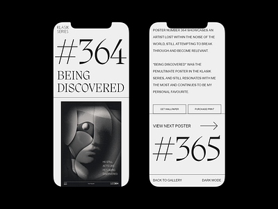
Further exploration for the Klasik Series gallery project. Mobile version now.
One thing I found the layout lacking, was a slightly more stylish typographic treatment for the numbers and poster titles. Therefore, I'm trying out "Migra" by Pangram Pangram for this one.
Let me know what you think!
--
Stay in touch for more design work!
Website | Instagram | Behance | Print Store
More by Filip Felbar View profile
Like

