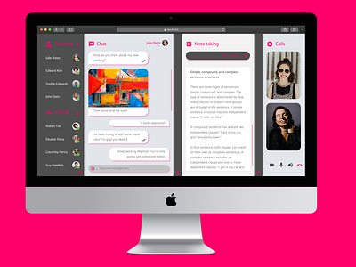
Direct Messaging Mockup
This was part of a Daily UI Challenge, where the goal was to create a Direct Messaging page. The inspiration for this came from e-learning websites. I decided to offer a messaging website that was able to combine features such as video calls, chat and note taking, having lists of contacts that split between teachers and friends.
The user is able to video call their teachers, chat with them and have a note taking section to the side in order to write anything they find useful. They are also able to hide the Note Taking, Contacts and Calls sections.
For the color palette I went with a scale of gray for the backgrounds, something that was sort of easy on the eye and that wasn't too dramatic. The pop of color is applied through a hot pink used in titles and icons, which are part of the Material Design Icons. Images were taken from Unsplash and the only font used was Catamaran.
The usual design conventions were applied in order to help the user identify what represents each element (different shapes for chat boxes, notes and buttons, change of color & font size for titles & text). A grid was used to create every section in a proportional way. The traditional video call options [video, microphone, audio and end call] were added in the calls section.
If I had to change anything, I would leave extra room for the website's name [it was only placed on the navigation bar].
