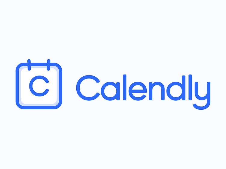
My Calendly refresh
Calendly updated their logo recently - using an augmented version of Gilroy for their wordmark and a logo that kind of looks like a toilet.
I attempted my own redesign using their bold new brand color and a secondary that isn't pure cyan.
I focused on the strong forms on their previous logo but thickened lines and adjusted proportions. I made sure to leave enough space between characters in the wordmark since their redesign seemed really tight and hard to read.
The result is something that is admittedly more iterative than the sudden shift Calendly has decided to take, but I think it works well.
More by Efrain Calderon View profile
Like
