RealFit
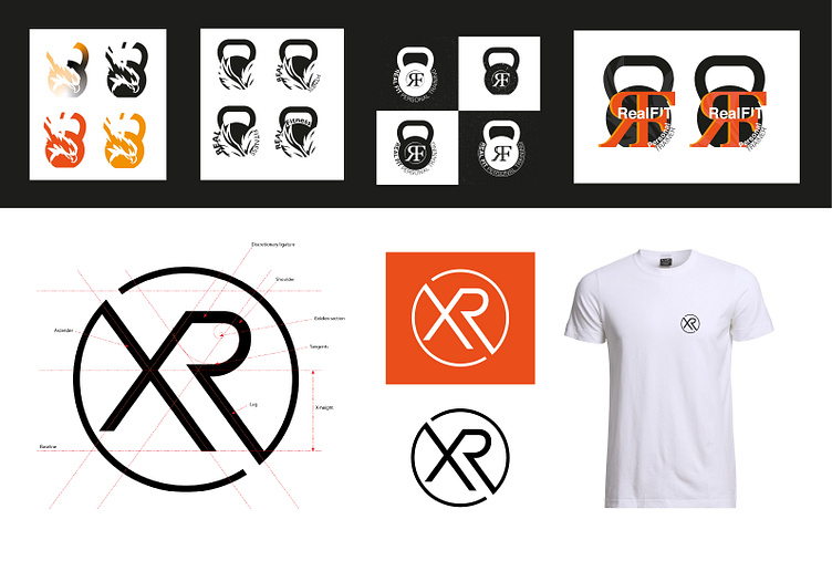
This logo lived many lives, the process of creating iterations was one of the most interesting and creative yet and the end result is something that really generates attention, engages clients and reflects the professional goals of the brand.
I knew my client wanted something bold but in keeping with what you would usually see in a gym, we went through a process of looking at and playing off standard fitness logos and started to hone in on the typography aspect, eventually leaving us with a clean and clear XR within the broken circle.
We worked closely on perfecting the line weights, extensions, spacing of the ligature and ratios of the x-height to his exact preference, as you can see I have added a golden section in the shoulder of the ‘R’ and played with how it sits on the baseline to really optically contain it within the circle. I’ve also adjusted the base font using parallel lines that have been reflected at the centre point to make it more rigid and dynamic, otherwise creating a feeling of “stable motion” to mirror the idea of strength in movement from fitness.
