Uber Eats App Redesign
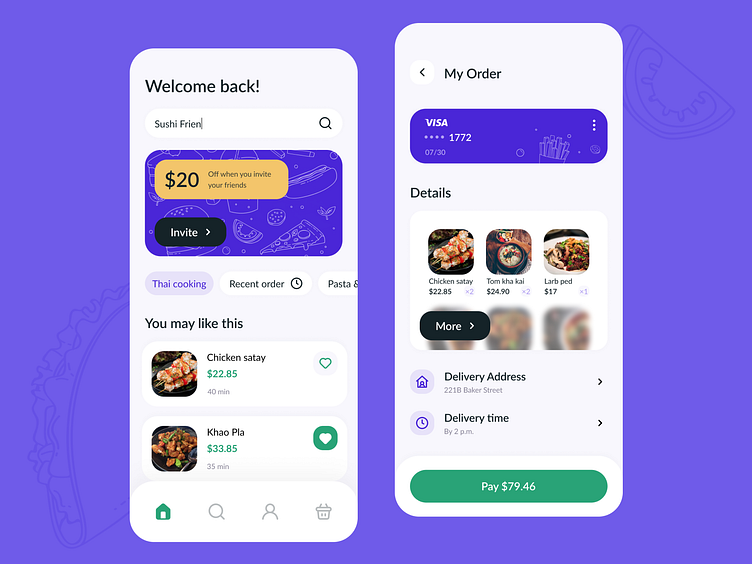
🌮 The first screen is the main screen, here users can search for dishes and repeat the last order. There’s also a banner with an offer from Uber.
💰 On the second screen you can see order information: payment method, list of chosen dishes, address, delivery time and the final price.
☂️ When choosing the color scheme, I decided to keep the Uber’s brand colors: black, green and mustard yellow. To freshen the design, I added a new color — bright purple. It perfectly combines with the other colors.
👍 The interface now looks more modern and pretty. I got rid of extra elements that used to clutter the screens — now the app is much more usable.
More by Valerie Sablina View profile
Like
