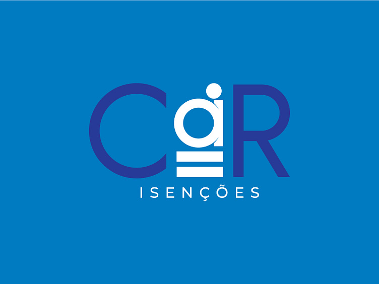
Car Isenções | Branding
The Car Exemptions brand comes into the world with the purpose of helping and assisting people with disabilities (PwD) and with reduced mobility, who want to realize the dream of having their own car free of taxes, according to the law.
Our studio was responsible for developing the logo and the visual identity of the brand, aligning the concept with the purpose of bringing inclusion, equality and equity to the PwD audience.
For this, we start from the main point of the brand, which is equity, the ability to judge impartially and fairly. That is, to consider people's limitations and adapt the tools to have the same possibilities to perform the same activities in a fair way.
To create the symbology, we use the semiotics of 3 elements that are present in the isotype: The letter "A" as the central point of the logo, the PcD symbology that is used to represent a reserved, available or accessible space and finally the equality, here, playing the role of equity leaving the isotype, (letter A), at the same time in relation to the entire imagotype.
We create a clear, objective and minimalist identity, we mirror these attributes throughout branding and brand communication.
Client: Car Isenções Agency: DigitalRP
