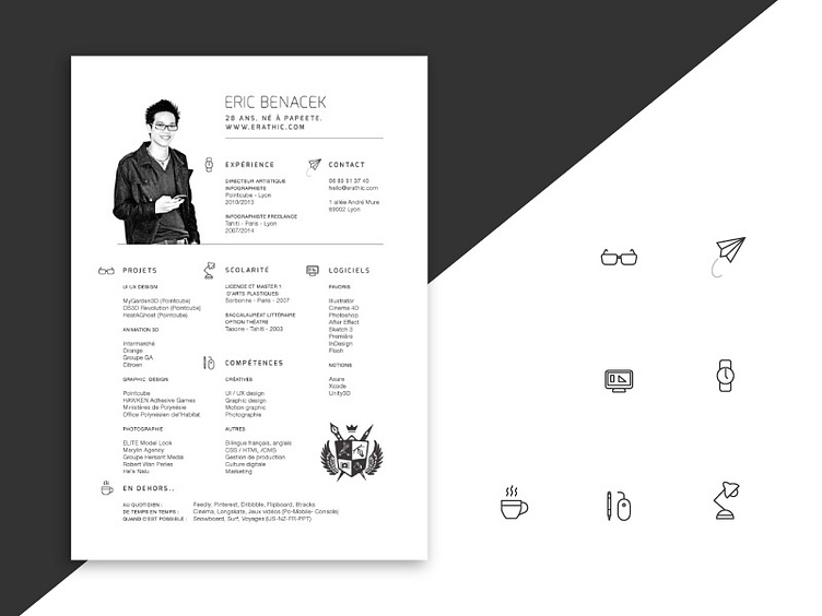
Simple Resume and icons
Here my new resume layout, I tried to keep it simple, since there's a lot of informations to display I couldn't find a way to fit fancy diagrams :(. Also I avoided colors to be printer-friendly. What do you think? Criticism welcomed !
More by Eric Benacek View profile
Like
