Logistic company logo fnd style
From the brief of the customer: “I would like it to be non-repulsive, that is, neutral in a sense, and after that - calmly, confidently and capaciously / briefly inform that it is a reliable modern operational (fast, adaptable) company.”
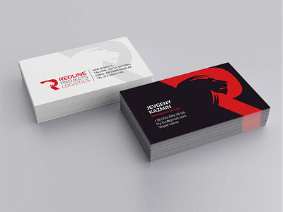
The accepted version contains a sign in the form of a stylized first letter of the name, made, as it were, by one line. Inside the letter, instead of the lumen, the lion’s head is used at the request of the customer, as a symbol of dignity and reliable cooperation. Also, the sounding of the word Line echoes Lion.
Soon it will be possible to see on the website: redline.ee