Trivago Retro
🕰️ Retro Logo Rebirth: Groovy With A Wild West Twist 🕺
Step 1: 🕵️♂️ Time-Traveling Exploration
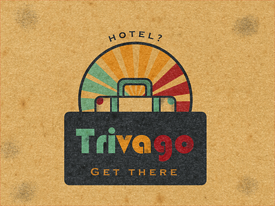
My journey began by diving head-first into the funky world of the 50s 60s and 70s. Channeling my inner hippie, I embarked on combining the vibrant colors of the sun in the wanderlust that trivago inspires. Bold and curvy lines defined the times and harmonize with the sunny vibes.🌞
Step 2: 🌵 Wild West Fusion
But wait, there's a twist in this retro tale! I have decided to fuse the era's charm with a dash of Wild West spirit. Yeahh! Adding the rustic textures of old paper and evoking the rugged landscapes and adventurous trips I have had in my country Colombia. This textured touch added depth and character, turning our logo into a treasure map of memories waiting to be explored. ❤️🎉
Step 3: 🚂 Train Ticket Whispers
And that's not all – I wanted our logo to carry the whispers of vintage travel. So, I adorned it with train ticket stamps, harkening back to the era of steam locomotives and cross-country adventures. These faded marks told stories of journeys taken, echoing the era's spirit of exploration.🌻
Step 4: ✨ Disco Ball Applause meets Desert Sunset
With the revamped retro logo ready to rock, I presented it to my audience. The brand's stakeholders were transported to a unique journey of nostalgia and excitement. Their response? A standing ovation of applause and cowboy whistles! 🌅🌈
From exploration to execution, this logo now shines as a treasure in my portfolio.
I have created a symbol of the hotel brand's commitment to offering guests a groovy, rugged, and unforgettable experience – with a train ticket to the past as an added bonus! 🏨🚀🎫
What have I learned?
True creativity begins with bold exploration ✨✨✨
This was made with love for trivago: https://www.trivago.com/
I could not resist of doing more of the same logo. What do you guys think?


